Humans make split-second decisions based on emotion
Think of your brand as a person with a personality. You want your brand to encompass SUBSTANCE and STYLE. Like people, you want your brand to have depth. An attractive person with no depth is boring and usually self-centered. What does your brand stand for? What does your brand stand against? Who does your brand serve and why? The key to communicating your brand personality effectively and making a first impression that is aligned with the deeper layers of your brand and attracting your dream client is clarity. Capturing the right emotion right from the start requires clarity. Inundated with advertisements and marketing at every turn and every swipe, humans make split-second decisions based on emotion. Your brand’s job is to hook the viewer instantly or not at all.
What emotion should your dream customer feel when they encounter your brand for the first time and every time thereafter? Do you want them to feel safe and secure, happy, inspired, sentimental, nostalgic? Depending on what you sell, the emotion your brand evokes will vary and all your brand elements should be aligned with the dominant emotion of your brand.
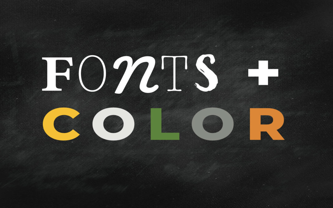
The combination of fonts and colors you choose along with images and your brand voice will help communicate your brand’s unique personality. Just like snowflakes and people there are no two brands exactly the same. Let’s dive into choosing colors and then fonts that capture your brand’s unique story. Download our FONTS + COLOR workbook to follow the process we outline below with ease.

Choosing a Perfect Color Scheme for your Brand’s Unique Personality

Color is the language of emotion. When it comes to color keep it simple and remember less is more. We recommend choosing one primary color, a secondary, or accent color, and one to three supporting neutral colors. At this point, the most important step is choosing the primary and accent colors. Don’t worry too much about tones, tints, or shades. After you have nailed down your colors and fonts we suggest creating your mood board which will give you the step by step directions for how to put your newly-chosen colors to work and help you decide on specific color formulas.
1. Choosing a primary color
Without spending too much time analyzing the color wheel, go to page 5 of our FONTS + COLOR workbook and circle 10 words. Now go to page 6 and rank the ten words you circled in order from one to ten with number one being most aligned with your business and ten being less aligned with your business.
If you did not download the workbook and want to follow the steps on your own, use the color wheel above to decide on ten emotions that best represent your brand personality and rank them from one to ten.
Think about who you are serving, what emotions you want them to feel when encountering your brand, and what emotion you want them to feel when they have the success or result of your product or service.
2. MOOD + EMOTION = COLOR
On page 6 of the workbook assign a color to each mood or emotion from the color wheel. Some words may occur in multiple color categories, choose one color for each mood/emotion. Then move on to step three on page 7.
3. COLOR brainstorming
Now on page 7 of the workbook or on a piece of paper, analyze your results from step two. Explore color combinations based on your findings. Was there one color that showed up more than the others? Was there a tie between two colors? Was there a color that showed up that surprised you? One that didn’t show up? Consider a color you wouldn’t normally choose. Sometimes a new perspective can open your eyes to something you hadn’t considered before. And remember the point of this exercise is to help you choose brand appropriate colors. Sometimes the colors we love are not the right colors for our brand personality.
4. Top Three Color Combinations
Now that you’ve had a chance to analyze your findings from step two, narrow it down to three color combinations. Each with a primary color and a secondary color. Start by choosing three primary colors, then decide on three secondary or accent colors. Your secondary color should complement your primary color. To choose a complimentary color, consider a secondary emotion, a color opposite on the color wheel (complementary), or a color next to your primary color on the color wheel (analogous).
This will give you a chance to consider a color combination that maybe hadn’t been considered before. Start looking around your physical space as well as the internet for these color combinations and see what comes up for you. Do you see other brands in your industry using similar colors? Think about a color combination that is different than others in your industry. The goal here is to come up with a color scheme that evokes the right emotion but at the same time stands out in the marketplace. You want to be different not the same. Think outside the box. How can you choose a primary color and a secondary color that work well together and aren’t the industry standard.
For example, how many fast food companies use the colors red and yellow? There’s a good scientific reason behind that choice but at the same time, it’s important to find what makes you different and use color to highlight those differences. If you were a fast food business that focused on healthy options maybe your colors could be green and burned orange or brick-red. Red entices hunger and green is fresh. The tints and shades you choose will also be a factor in your overall branding. You’ll be able to choose specific color formulas when you create your mood board which we suggest doing after you choose your fonts.
5. Final Color Choices
Narrow down your selection in step 4 to one color combination and write it down. Once you have completed choosing colors and fonts go create your mood board using the information you have gathered up to this point. You’ll be able to stylize your brand with images and specific color formulas to bring it all together visually.
Choosing the Right Fonts For Your Brand’s Unique Personality
When it comes to fonts there’s nothing like the classics like Bodoni, Futura, Clarendon, or Garamond but these days Google Fonts pretty much rule. They allow far more unique, web-friendly fonts on the internet than ever before. It wasn’t too long ago that we were confined to a shortlist of web-safe fonts such as Arial, Verdana, Times New Roman, or the dreadful Comic Sans. So although Google Fonts, in my opinion, are no comparison to the classics, they offer many options for web viewing.
Choosing the right fonts for your business is all about capturing a mood as with color. Fonts have personality and can help communicate your brand’s unique personality. When combined with color, images, and your brand voice, fonts play a significant visual role.
We will walk you through the steps to choose your brand fonts. These fonts will be used in all your branding and marketing materials for print and web. Your logo font is probably going to use an entirely different font. If you already have a logo make sure the fonts you choose don’t clash. If you don’t already have a logo even better, you’re starting from a clean slate which makes it easier.
Take a look at the diagram below to get an overview of the six categories most fonts fall into. As you can see the diagram offers examples for each category along with personality traits to help you start to see where your brand personality might fall.

If you haven’t already done so, download our free FONTS + COLOR WORKBOOK and we’ll guide you through our process so you can decide on fonts and colors that effectively communicate your brand’s unique personality.
The biggest mistake amateur brands make when it comes to fonts is they use too many fonts, switching it up from platform to platform seemingly based on the mood they’re in that day. Choosing specific fonts right from the start will help you avoid making that mistake as you’re building a cohesive brand.
Just as we mentioned with choosing a color scheme, less is more for fonts as well. Choose two fonts, a heading font, and a body font. You may want to choose a subheading font as well but keep it simple. Subheading fonts that are the same as the heading font with a thinner stroke or smaller font size work well.
1. Choose 1-2 Font Categories
On page 9 of the workbook, circle 1-2 font categories from the font diagram that best represents your brand. Identify what personality traits your brand should communicate. Is your brand classic, modern, bold, elegant, informal, unique? A combination of traits such as bold AND youthful, or modern and unique. If so look for fonts that overlap in more than one category or think about choosing a heading font that is Unique and a body font that is Modern.
2. Choose your body font
Once you have nailed down what category your brand falls into, explore Google Fonts to nail down a font. Within Google Fonts you’ll be able to narrow down your search with filters for font categories and font properties which will save you time. Searching fonts can be a huge time suck you’ll need to use filters for sure. Look for fonts in the categories you chose in step one. Write down the fonts you are considering in the space provided in the workbook or on a piece of paper.
For your heading font, careful choosing within the Unique category. You don’t want the font to overwhelm everything else and you don’t want it to limit your brand. If the font is too overly stylish you not only take the risk of the font being overwhelming but it could also be hard to read, and difficult to work with the other aspects of you brand.
For your body font, you really don’t need to overthink it. Keep it simple. It should be easy to read so choose a simple serif font or san-serif font that works well with your heading font. Ultra classic? Try two serif fonts. Ultra-modern? Try two san serif fonts. Somewhere in between or totally outside the box? Mix it up. Consider combining a serif with a san serif for your font pair.
For example, if you chose a serif font for your heading font such as Playfair Display Black, a sans-serif body font such as Source Sans Regular would work really well for a timeless feel. The rule of thumb is, make sure the two fonts you choose are different enough that there’s some contrast. The simple way to do this to choose a heading font that is much thicker in weight. If you don’t have enough contrast between your two fonts you might as well just use the same font for your heading and body font with a heavier weight such as the same font in bold for the heading font. If your two fonts are too similar it will read as unprofessional.
3. Choose Top Three Font Pairings
Narrow down your choices from step two down to three pairings. Once you have selected three pairs, play with each in a document and see how the heading font looks with your body font. Use dummy text and create a mock-up using each set of fonts. What do you think?
4. Final Font Pairings
Now, narrow it down to one pairing set based on what you came up with in the previous step. Write them down and don’t forget. Now that you have nailed it down, and as you are building your brand, stick with these fonts throughout all the platforms you are using. One of the biggest mistakes amateur brands make is using different fonts throughout their branding and marketing collateral. Keep it simple and keep it streamlined. Your brand will thank you for it.